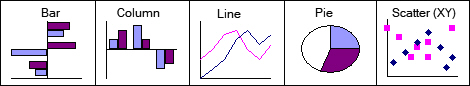
10 Chart Types
- Chart types.
- Line chart vs Scatter chart.
Charts are used to visualize data and easily compare numbers. Excel offers a wide variety of chart types. This section does not discuss which type is best suited for each situation.
Despite the large number of chart types, there are essentially only a limited number of basic types.
All these basic types have many variants, which can initially cause confusion. Choosing a good chart type for visualizing data is important. Ask yourself questions like:
- What should the chart convey?
- What facts are being compared?
10.1 Column Chart
Column charts are most suitable if the data includes time units like years, quarters, months, weeks, and days. Avoid using too many data points; a maximum of five to six values is ideal. If you have more than six values on the horizontal axis, a line chart is preferable.
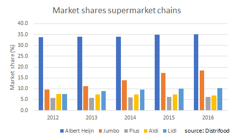
Figure 10.2 shows the market shares of some supermarket chains in the Netherlands from 2012 to 2016 (source: Distrifood).
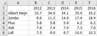
This data is best displayed in a column chart, as shown in Figure 10.3.
Task 10.1 File: Chart_Column.xlsx
Open the file.
Select any cell in the data area.
Choose Insert > Insert Column or Bar Chart (Charts group) > Clustered Column.
Change the titles:
- Chart title:
Market shares of supermarket chains - Vertical axis title:
Market share (%)
- Chart title:
Choose Insert > Text Box (Text group).
Draw a rectangle in the bottom right corner with the mouse, and then type the text “Source: Distrifood”.
Select the text, Right mouse click > Font > tab Font > Size 9 > OK.
10.2 Bar Chart
Bar charts are widely used to clearly show differences in ranking. They can effectively express the importance (priority) of certain items at a specific moment.
The results are usually sorted from highest to lowest, so the highest result is displayed as the first bar.
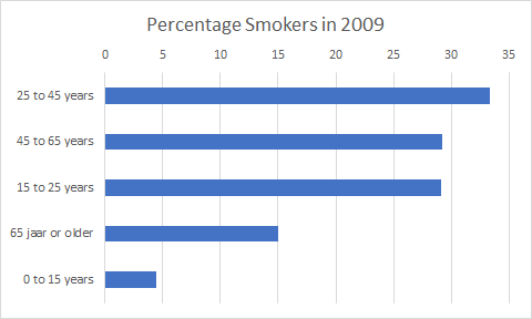
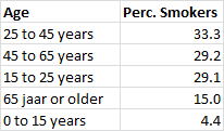
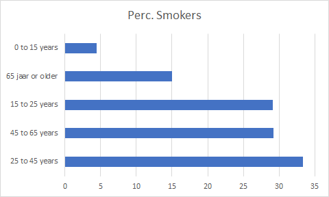
Figure 10.4 shows the percentage of smokers by age group in 2009 (source: CBS).
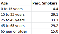
The data should be displayed in a bar chart, as shown in Figure 10.5.
Task 10.2 File: Chart_Bar.xlsx
Open the file.
Sort the table by the percentage of smokers, from highest to lowest.
Select any cell in the data area.
Choose tab Insert > Insert Column or bar Chart (Charts group) > Clustered Bar.
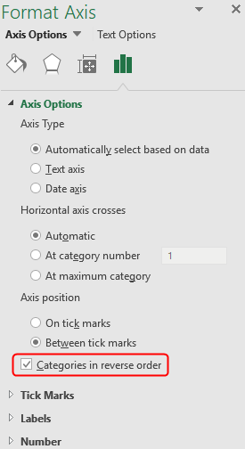
The bar chart appears in the worksheet with the longest bar at the bottom. This is Excel’s default setting, but the order and the title need to be changed.
Select the vertical axis, Right mouse click > Format Axis. The Format Axis task pane appears.
In Axis Options select Categories in reverse order.
- Change the chart title to “Percentage of Smokers in 2009”.
10.3 Pie Chart
Pie charts are mainly used to display the percentage distribution of data within a group, such as election results. Too much information can make a pie chart cluttered. For clarity, a pie chart should have at most six or seven sectors.
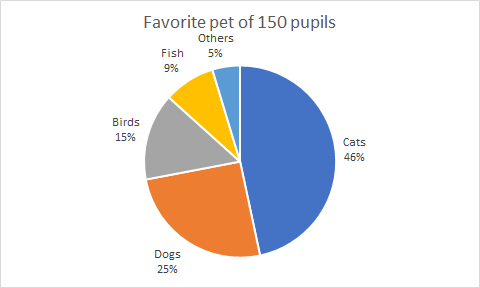
Table 10.1 shows the results of a survey asking 150 pupils about their favorite pet.
| Pet | Frequency |
|---|---|
| Cats | 70 |
| Dogs | 38 |
| Birds | 22 |
| Fish | 13 |
| Others | 7 |
The data should be displayed in a pie chart, as shown in Figure 10.9.
Task 10.3 File: Chart_Pie.xlsx
Open the file.
Select any cell in the data area.
Choose Insert > Insert Pie or Doughnut Chart (Charts group) > Pie.
Add data labels and position them Outside End.
Select the data labels, right-click and select Format Data Labels. The Format Data Labels task pane appears.
In the task pane, select Category Name and Percentage, and deselect Value.
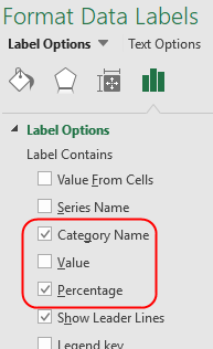
Remove the legend.
Change the chart title in “Favorite Pet of 150 Pupils”.
Choosing Data Call Out instead of Outside End for data labels immediately displays the category names and percentages. Try it.
10.4 Line Chart
Line charts visualize trends in data over time. In line charts, the time unit is plotted along the horizontal axis (the category axis), and the measured variable is plotted along the vertical axis. A line connects the points on the graph to visualize the trend in data over time.
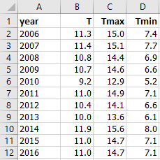
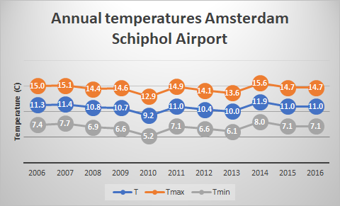
Figure 10.11 shows annual temperature data (°C) for Amsterdam Airport Schiphol (source: https://en.tutiempo.net/climate/ws-62400.html).
- T = Average annual temperature
- Tmax = Annual average maximum temperature
- Tmin = Average annual minimum temperature
The data is to be displayed in a line chart, as shown in Figure 10.12.
Task 10.4 File: Chart_Line.xlsx
Open the file.
Select any cell in the data area.
Choose Insert > Recommended Chart (Charts group) > Line.
Change the titles:
- Chart title: “Annual Temperatures Amsterdam Schiphol Airport”
- Vertical axis title: “Temperature (°C)”.
Select the chart and change the style using Chart Design > Chart Styles. Choose a style you like.
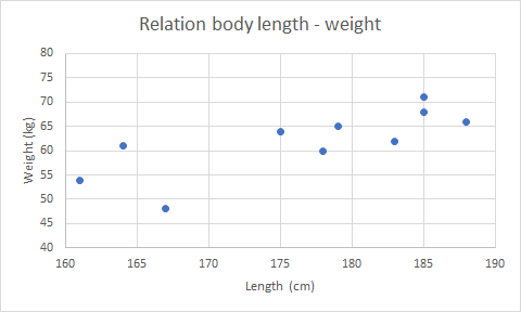
10.5 Scatter (XY) Chart
A scatter chart (or XY diagram) is suitable for analyzing and showing the relationship between two numeric variables. It also allows you to determine a trend line. The chart plots the values of two numeric variables against each other, with each pair forming a point in the chart.
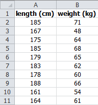
Figure 10.13 shows data from an investigation into the relationship between body length and weight for 10 students.
The data should be displayed in a scatter chart, as shown in Figure 10.14.
Task 10.5 File: Chart_Scatter.xlsx
Open the file.
Select any cell in the data area.
Choose Insert > Insert Scatter (XY) or Bubble Chart (Charts group) > Scatter.
Change the titles:
- Chart title: “Relationship between Body Length and Weight”
- Horizontal axis title: “Length (cm)”
- Vertical axis title: “Weight (kg)”
Change the scale of the horizontal axis to run from 160 to 190, with increments of 5.
Change the scale of the vertical axis to run from 40 to 80, with increments of 5.
Select axis > Right click > Format Axis > Axis Options
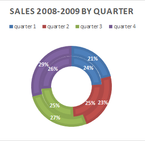
10.6 Doughnut Chart
A doughnut chart is an extension of the pie chart. It can contain one or more rings, with each ring representing a data series. Use a doughnut chart to show the percentage distribution of multiple data series.
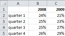
Figure 10.15 shows the quarterly sales of a company for 2008 and 2009.
This data should be displayed in a doughnut chart, as shown in Figure 10.16.
Task 10.6 File: Chart_Doughnut.xlsx
Open the file.
Select any cell in the data area.
Choose Insert > Insert Pie or Doughnut Chart (Charts group) > Doughnut.
Some adjustments are still needed. In this example, some of the formatting will be applied using a predefined chart style.
Change the chart title to “Sales 2008-2009 by quarter”.
Select the chart and change the style using Chart Design > Chart Styles. Choose a style you like.
10.7 Area Chart
Area charts are based on line charts. The area between the axis and the line is typically emphasized with colors or hatching. Like a line chart, an area chart plots the size of a variable against time. In a stacked area chart, multiple data series are placed on top of each other, showing the sum of the data. Area charts effectively visualize trends.
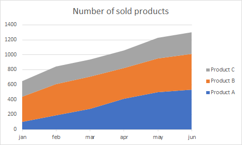
A company sells three products: A, B, and C. Figure 10.17 shows the sales quantities during the first half-year.
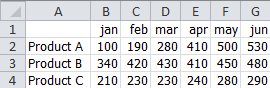
The data is to be displayed in a stacked area chart, as shown in Figure 10.18.
Task 10.7 File: Chart_Area.xlsx
Open the file.
Select any cell in the data area.
Choose Insert > Recommended Charts (Charts group) > Stacked Area > OK.
Change the chart title in “Number of items sold”.
Select the legend, then right-click and choose Format legend. Change the legend’s position from Bottom to Right.
Select legend > Right click > Format Legend > Legend Options
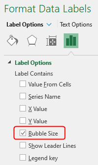
10.8 Bubble Chart
A bubble chart can display the relationship between three numeric variables.
It is an extension of the scatter chart. While a scatter chart plots two numeric variables (X and Y) against each other, a bubble chart adds a third variable (Z). The point in the scatter chart is replaced by a bubble (or circle). The center of the bubble is determined by the X and Y variables, and the bubble’s size (radius) is determined by the Z variable. Other bubble characteristics, such as color, can indicate additional qualitative, non-numeric differences.
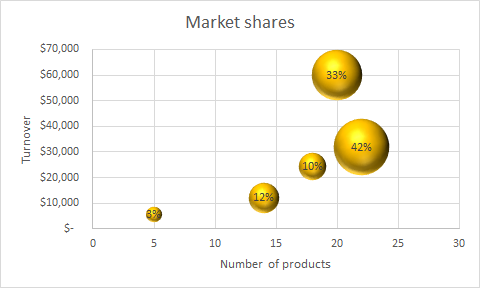
Figure 10.19 shows the relationship between market share, turnover, and the number of products.
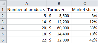
The data is to be displayed in a bubble chart, as shown in Figure 10.20.
Task 10.8 File: Chart_Bubble.xlsx
Open the file.
Format the values for turnover and market share appropriately.
Proper formatting of the source data ensures proper formatting in the chart.
Select any cell in the data area.
Choose Insert > Insert Scatter (XY) or Bubble Chart (Charts group) > 3-D Bubble.
Make the following changes:
- Chart title: “Market shares”
- Horizontal axis title: “Number of products”
- Vertical axis title: “Turnover”
- Scale the vertical axis: 0 to 70000 (set the minimum to fixed 0 and the maximum to fixed 70000)
- Color bubbles: orange/golden
- Data labels: position centered, display the percentage of market share
The added data labels are not the desired ones. By default, the Y value (turnover in this case) is displayed. Change this to the bubble size, which represents the market share.
- InLabel Contains, select only Bubble Size.
10.9 Radar Chart
A radar chart plots multiple data series (categories) along separate axes that start from a central point (the origin). The chart resembles a spider web and is also called a spider chart or star chart. The angles between the axes are equal, and the data points on the axes are usually connected by a line.
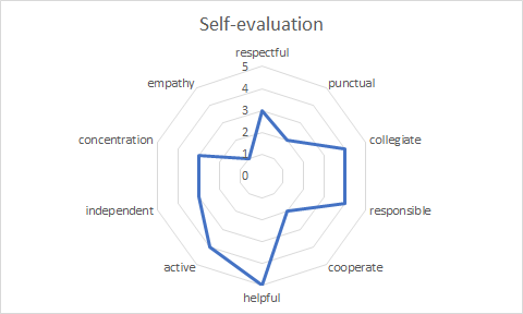
Figure 10.21 shows the scores of a self-evaluation on a 5-point Likert scale.
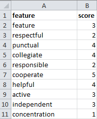
The data should be displayed in a radar chart, as shown in Figure 10.22.
Task 10.9 File: Chart_Radar.xlsx
Open the file.
Select any cell in the data area.
Choose Insert > Insert Surface or Radar Chart (Charts group) > Radar.
Change the chart title in “Self-evaluation”.
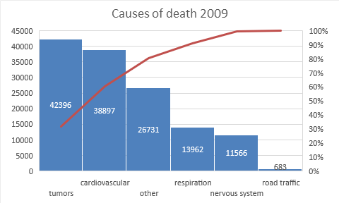
10.10 Pareto Chart
A Pareto chart combines a column chart and a line chart. The column chart displays values sorted from largest to smallest, while the line chart, placed on top of the columns, shows the cumulative percentage. The column chart uses the regular Y-axis on the left, and the line chart uses a second Y-axis on the right with values from 0% to 100%.
Pareto charts are often used in quality control to identify the most significant factors.
Figure 10.23 shows the main causes of death in the Netherlands in 2009 (source: CBS).
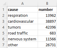
The data should be displayed in a Pareto chart, as shown in Figure 10.24.
Task 10.10 File: Chart_Pareto.xlsx
Open the file.
Select any cell in the data area.
Choose Insert > recommanded charts > tab All Charts > Histogram > Pareto.
Change the chart title and add data labels.
10.11 Control chart
Control charts are used in statistical process control (SPC) to verify that a process variable is under control. The value of such a variable must remain within certain limits. A control chart is essentially a line chart of the variable’s measurements with horizontal lines for the control limits.
Limits
UCL: Upper Control Limit
LCL: Lower Control Limit
The control limits are calculated from the data and are typically set at 2-3 standard deviations from the mean, depending on the process type. Often, a horizontal line representing the mean (CL - Central Line) is also included in the control chart.
Task 10.11 File: Chart_Control.xlsx
For example, consider a continuous chemical process where the temperature of the reaction mixture is monitored hourly. Proper control of this process requires the temperature to remain within 2 standard deviations of the mean.
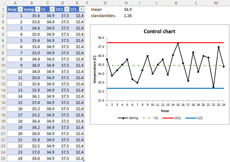
Open the file. The file contains a table with hour and temperature data.
Enter formulas in cells H1 and H2 to calculate the mean and standard deviation of the temperature data.
Enter the following formulas
In column CL:
=$H$1In column UCL:
= $H$1 + 2*$H$2In column LCL:
= $H$1 - 2*$H$2
Select all data in the table and insert a line chart with markers.
Adjust the layout as desired.
You can find extensive information about SPC and control charts online. A useful article is Control Limits and Specifications: The Four Process States
10.12 Line or Scatter Chart?
Line charts and scatter charts appear quite similar, especially when a scatter chart is displayed with connecting lines. However, there are significant differences in how data is plotted along the horizontal axis (x-axis) and the vertical axis (y-axis). Therefore, it’s crucial to make the right choice to avoid misinterpretations.
Example 10.1 Annual Sales Data
Figure 10.26 tshows the annual sales data of a company plotted with a line chart and a scatter chart.
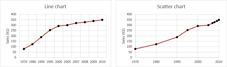
The difference in scaling can lead to incorrect conclusions. The line chart suggests strong growth in the early years and stagnation in recent years, which is misleading. The scatter chart accurately represents the growth.
Line chart
- Vertical: value axis
- Horizontal: category axis
The horizontal axis has evenly spaced categories of data (text or dates). A date axis displays dates in chronological order.
Line charts are suitable for displaying the change of a variable over time. Examples include sales, turnover, profit, price, etc., by day, week, month, quarter, or year. The time unit is always on the horizontal axis, and the value of the measured variable is on the vertical axis.
Scatter chart
- Vertical: value axis
- Horizontal: value axis
The horizontal axis can display numeric or date values, and you can change the scaling options of both axes. The chart displays points at the intersection of the x-value and the y-value.
Scatter charts are used to examine the relationship between two variables. They help determine how one variable changes in response to changes in the other. The data values are displayed as separate points on the chart.
While you can connect the points with lines, it’s generally not recommended because it implies that the changes follow those lines. It’s better to represent the relationship with a trendline, which is a line that best reflects the relationship between the two variables. The measured points may lie on or be distributed around the trendline.
Scatter charts are commonly used in science and technology. Management reports may also include scatter charts, for example, to analyze the correlation between price increases and sales.
10.13 Translation of Chart Type Names
| NL | EN | DE |
|---|---|---|
| Bellendiagram | Bubble chart | Blasendiagramm |
| Cirkeldiagram | Pie chart | Kreisdiagramm |
| Kolomdiagram | Column chart | Säulendiagramm |
| Lijndiagram | Line chart | Liniendiagramm |
| Ringdiagram | Doughnut chart | Ringdiagramm |
| Radardiagram | Radar chart | Netzdiagramm |
| Spreidingsdiagram | Scatter (XY) chart | Punktdiagramm |
| Staafdiagram | Bar chart | Balkendiagramm |
| Vlakdiagram | Area chart | Flächendiagramm |
| Watervaldiagram | Waterfall chart | Wasserfalldiagramm |