9 Charts
- Parts of a chart.
- Creating charts.
- Adjustments of chart parts.
- Location and size of a chart.
- Formatting a chart.
Charts are an important tool in analyzing data. They can display information clearly, and their power should not be underestimated. Trends and patterns can be easily visualized, and abnormalities or fluctuations become readily apparent.
Excel offers a wide range of chart types, making it important to choose the right one. When Excel is installed, the Grouped Column chart type is the default, but this setting can be changed.
To easily create a chart in Excel, the data should be well-organized in the worksheet, ideally in a table format.
Charts can be located in two ways:
- As an object in a worksheet. This is called an embedded chart. The advantage is that you can view and print the chart alongside the data.
- On a special worksheet dedicated to the chart, called a chart sheet.
The chart’s location can be changed later.
9.1 Chart Elements
A chart consists of many elements, not all of which are included by default in Excel. They can be added, moved, or deleted as needed.
The most important parts of a chart are:
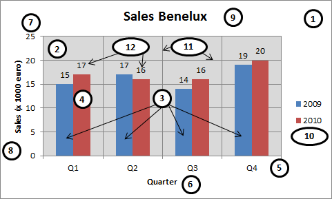
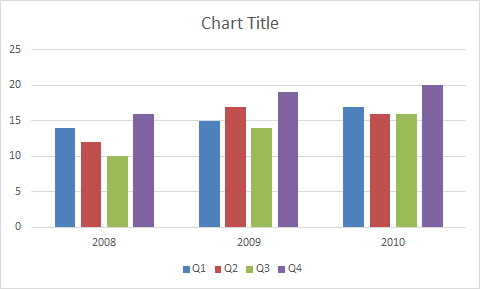
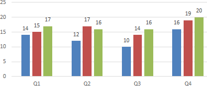
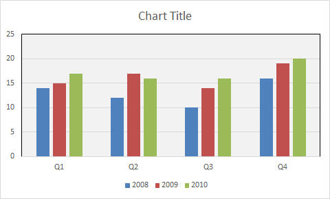
- Chart area (1)
-
The entire chart, including all its elements.
- Plot area (2)
-
The rectangular area bounded by the axes, containing all data series. In the figure, this is the area with the light-colored background.
- Data series (3)
-
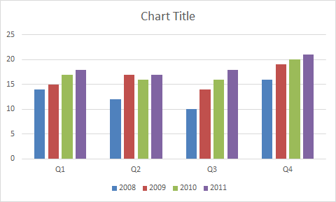
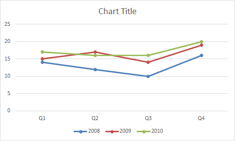
A row or column of numbers from your worksheet that are plotted in the chart. The example chart has two data series: the blue and brown colored sets. Data series have names (here, “2009” and “2010”), which form the legend.
- Data point (4)
-
An individual value (bar, column, point, etc.) in the chart. Each column in the chart is a data point, with a total of eight data points shown.
- Category axis (5)
-
The horizontal axis or X-axis. The text labels along this axis come from cells in the worksheet. In the example, the categories are “Q1,” “Q2,” “Q3,” and “Q4.”
- Horizontal axis title (6)
-
This title identifies the type of data along the horizontal axis. For example, if it’s not clear that “Q1, Q2, Q3, Q4” represents quarters, you can add a title to clarify.
- Value axis (7)
-
The vertical axis or Y-axis, which usually contains numbers.
- Vertical axis title (8)
-
This title is important for identifying the units along the axis.
- Chart title (9)
-
A short text that indicates the chart’s subject. It usually appears in a larger font near the top of the chart.
- Legend (10)
-
A box that identifies the patterns or colors assigned to the data series or categories.
- Gridlines (11)
-
Horizontal or vertical lines in the plot area.
- Data labels (12)
-
Numbers associated with data points, providing their actual values.
9.2 Creating a Recommended Chart
Excel offers many chart types, and choosing the most appropriate one can be challenging. The Recommended Charts command can help by suggesting suitable charts for your data. Always select the data first to use this feature effectively.
Task 9.1 File: Bakery.xlsx
Open the file.
Select any cell in the data area A1:D5.
If the data area is contiguous (like A1:D5 here), selecting any cell within it allows Excel to automatically recognize the entire data area. If the area is not contiguous, you must select the whole data area.
- Choose Insert > Recommended Charts (Charts group).
The Insert Chart dialog box appears. The left side displays a list of Excel’s recommended charts for your data, and clicking on a chart shows a preview on the right.
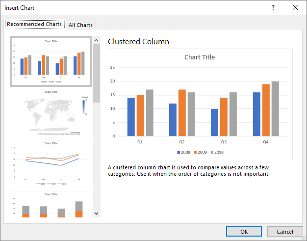
- Choose Clustered Column > OK.
The chart is embedded in the worksheet, and the Chart Design and Format tabs appear on the ribbon. These tabs are only visible when the chart is selected.
A frame surrounds the chart to indicate it is selected. In the upper-right corner, three buttons allow you to add or change::
 Chart Elements
 Chart Styles
 Chart Filters
An alternative, often quicker, method to insert a recommended chart is:
- Select the data, including the headings.
- Click the Quick Analysis button
 at the bottom right corner of the selected range.
 - Click Charts and select the desired chart.
9.3 Chart Operations
You can perform various operations on chart elements, depending on the specific element. For text elements, you can change the size, font, color, etc. To perform an operation, you must first select the element and then choose the operation from the menu or the right-click shortcut menu.
Selecting a chart element
This is usually straightforward, but it can be tricky when elements are close together.
After selecting the chart, you can select a chart element in the following ways:
- Click on the chart element.
- Use the menu Format tab > Chart Elements arrow (Current Selection group).
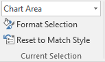
The Current Selection always displays the selected element. In Figure 9.4, the Chart Area is selected.
Selected parts are marked with sizing handles.

Moving an element
Select the element, hover the mouse pointer over its edge (not on a sizing handle), and drag it to the desired location.
Changing dimensions
When a resizable element is selected, it is surrounded by sizing handles. Drag a handle to change its height or width.
Formatting an element
Select the element and choose Format tab > Format Selection (Current Selection group). A task pane appears on the right with formatting options.
You can also access the task pane by right-clicking on the element and selecting Format ….
Applying a chart style
Excel provides predefined formats called styles. You can apply a style using the button.
Deleting a chart
Both embedded charts and chart sheets can be easily removed.
Choose one of the following options:
Embedded chart: Select the chart and press the Delete key.
Chart Sheet: Right-click on the chart sheet’s tab and select Delete from the shortcut menu.
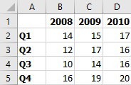
9.4 Switching Rows/Columns
The source data for a chart can be arranged either with data series in columns or rows. You can easily switch between these arrangements.
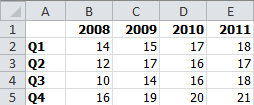
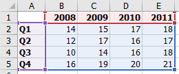
In the bakery’s sales data (Figure 9.2), the annual data is in columns, and the quarterly data is in rows. You can compare years, with each year as a data series (Figure 9.3), or compare quarters, with each quarter as a data series. When creating the chart, Excel tries to guess whether the columns or rows should be the data series. If Excel’s choice is incorrect, you can easily change it.
Task 9.2 File: Bakery_Chart.xlsx
Open the file.
Select the chart by clicking within the chart area.
A double border appears around the chart, and the mouse cursor changes to a cross with arrows  .
.
- Choose Chart Design > Switch Row/Column (Data group).
9.5 Changing Chart Location
You can create a chart on the same worksheet as the data (an embedded chart) or on a separate sheet that contains only the chart (a chart sheet). You can move an embedded chart by dragging it or move it to a chart sheet. This task demonstrates both methods.
Task 9.3 File: Bakery_Chart.xlsx
Open the file.
Select the chart by clicking within the chart area.
A double border appears around the chart, and the mouse cursor changes to a cross with arrows .
- Press the left mouse button and drag the chart to the desired location.
Holding down the Alt key while dragging snaps the chart to the worksheet’s gridlines.
Click outside the chart in the worksheet to deselect it.
elect the chart again and choose Chart Design > Move Chart (Location group).
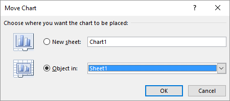
- Select New sheet, name the new sheet, and click OK.
You can also move a chart from a chart sheet to embed it in a worksheet.
Select the chart in the chart sheet.
Choose Chart Design > Move Chart (Location group).
Select Object in, choose the worksheet, and click OK.
The worksheet with the embedded chart is displayed and the chart sheet is deleted.
9.6 Resizing Charts
You can change a chart’s size by dragging its sizing handles. These handles may appear as small circles, squares, or dots. When an object is selected, a rectangular frame outlines it, and sizing handles appear at each corner and the middle of each side. Corner handles allow dragging in any direction, while middle handles restrict dragging to horizontal or vertical directions. You can enlarge or shrink the chart or specify exact dimensions.
Task 9.4 File: Bakery_Chart.xlsx
Open the file.
Select the chart by clicking within the chart area.
Hover the mouse pointer over a corner point until it turns into a double-headed arrow
 .
.Click the left mouse button and drag to the desired size.
Holding down the Alt key while dragging snaps the chart to the worksheet’s gridlines.
To specify exact dimensions:
Select the chart.
Choose Format > Height / Width (Size group).
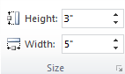
Enter the desired dimensions.
Click outside the chart in the worksheet to deselect it.
9.7 Chart Title
When you create a chart, the title appears above it by default. You can select the title text and type your desired title, hide the title, or change its location.
Task 9.5 File: Bakery_Chart.xlsx
Open the file.
Select the chart.
Choose Chart Design > Add Chart Element (Chart Layouts groep) > Chart Title.
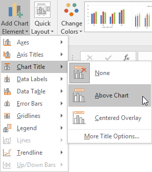
Choose Above Chart.
Double-click the title text “Chart Title” and replace it with your own text for example “Sales Bakery”.
Selecting
Noneremoves the chart title.You can move the chart title by dragging it.
You can format the title by selecting it, right-clicking, and choosing Format Chart Title.
Task 9.6 Faster method
Select the chart.
Click the Chart Element button
next to the chart to see a list of chart elements.Check Chart Title to immediately add the title to the chart.
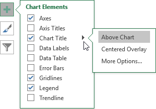
An arrow next to a chart element indicates a drop-down menu with more options.
Checked elements are present in the chart. Unchecking an element removes it.
The following tasks will primarily use this faster method.
9.8 Legend
A legend identifies the patterns or colors representing data series in a chart. By default, if applicable, the legend appears on the right. You can remove it or drag it to another location.
Task 9.7 File: Bakery_Chart.xlsx
The Chart elements button provides the following legend options:
- Right
- Top
- Left
- Bottom
- None (by deselecting)
Like the chart title, you can drag and format a legend.
Experiment with the options.
9.9 Axis Titles
Axis titles are labels along the horizontal and vertical axes that help explain the data.
Task 9.8 File: Bakery_Chart.xlsx
The Chart elements button provides the following options for Axis Titles:
- Primary Horizontal
- Primary Vertical
Add titles for both axes.
Change the horizontal title in “Time”.
Change the vertical title to “Sales (x 1000)”.
9.10 Data Labels
Data labels are numbers at the data points that display the actual values.
Task 9.9 File: Bakery_Chart.xlsx
The following options are available for data labels:
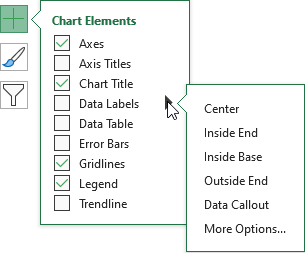
Experiment with these options. In Figure 9.11) you see the display for the Outside End option.
9.11 Gridlines
Gridlines are horizontal and vertical lines that extend from the axes across the chart’s plot area. They make the data easier to read by providing visual guides. You can display gridlines for major or minor intervals on the axes.
Task 9.10 File: Bakery_Chart.xlsx
The following options are available for gridlines:
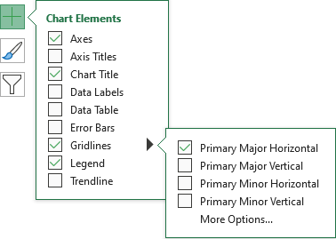
Hover the mouse over the options to preview the results in the chart.
9.12 Plot Area
The plot area is the rectangular area of the chart that displays the charted data. It is bounded by the axes and includes the axes but not the titles. You can format the plot area with a colored background and border.
Task 9.11 File: Bakery_Chart.xlsx
Open the file.
Select the plot area, right-click, and choose Format Plot Area. The Format Plot Area task pane appears.
Open the Fill option and select Solid fill with a light gray color.
Open the Border option and select Solid line with a black color
9.13 Adding and Removing Data Series
It’s common to add a new data series to an existing chart or remove an old one. The procedure depends on whether the data to be added or removed is directly adjacent to the existing data set. You can easily determine this by selecting a chart; Excel will highlight the corresponding source data in the worksheet with colored boxes.
- New series joins the highlighted area
-
Expand the data range by dragging the selection.
-
Delete a series at the beginning or end of the highlighted area by dragging.
- New series does not join the highlighted area
-
Use the Select data source dialog box.
Both techniques are covered in this section.
Task 9.12 File: Bakery_Chart.xlsx
Add a new 2011 data series by dragging
Open the file.
Add the new data for year 2011 in the range E1:E5, as shown in Figure 9.14).
- Select the chart. The source data is selected on the worksheet, showing the sizing handles.
- Drag the lower-right sizing handle to include the new data.
Task 9.13 Delete the 2008 dataset by dragging
- Select the chart.
The source data is selected on the worksheet, showing the sizing handles.
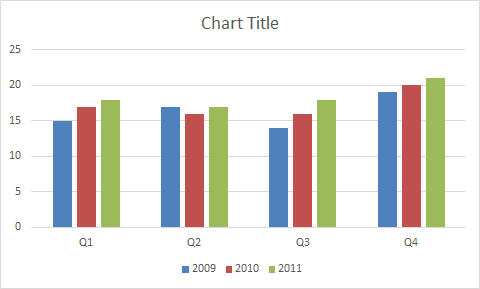
- Drag the lower-left sizing handle to exclude the data for 2008.
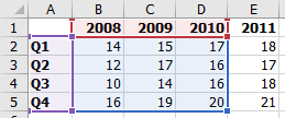
Task 9.14 Add the 2008 series and delete the 2011 series via the dialog box
- Right-click on the chart and choose Select Data….
An alternative is Chart Design tab > Select Data (Data group).
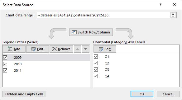
- Click the Add button.
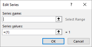
- Series name: The cell that contains the name of the data series.
- Series values: The cell range that contains the data values.
Place the cursor in the Series name box and then select cell B1 in the worksheet.
Select the contents of the Series values box and then select the range B2:B5 in the worksheet.
Click OK.
The 2008 data series is added to the chart and the Select Data Source dialog box. However, it’s added at the end, making the order illogical.
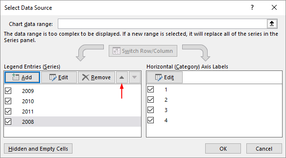
In the dialog box, select the 2008 series and click the Move Up arrow three times to make it the first series.
In the Select Data Source dialog box, select the 2011 series and click the Remove button.
The 2011 data series is removed, restoring the initial situation with the 2008-2010 data series.
9.14 Task: Changing Chart Type
You can easily change the chart type. This task demonstrates changing a column chart to a line chart.
Task 9.15 File: Bakery_Chart.xlsx
Open the file.
Select the chart.
Choose Chart Design > Change Chart Type (Type group).
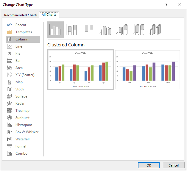
- Choose the Line with Markers type and click OK.
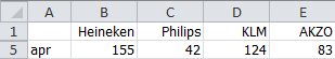
9.15 Case Share Prices
File: Stocks.xlsx
Figure 9.24 shows the average monthly share prices of four companies for January through March:
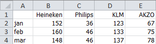
Create a line chart from this data.
Later, the entries for April are published:
Add this data to the chart.
The final result should look like this
- The chart type is a line chart (line with markers).
- When you create a chart, Excel might use the rows as data series instead of the columns. Correct this by switching rows/columns.
- Add a chart title. Format the title text in Palatino, 14 pt, bold.
- Add a vertical axis title.
- Scale the vertical axis so that the primary unit is 10.
- Add a legend below the horizontal axis and stretch the legend to display all texts in one row.
- Add horizontal dotted gridlines.
- Chart dimensions: width = 4” and height = 4”
9.16 Exercises
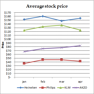
Exercise 9.1 Third-degree chart (graf001)
Create the following chart. Make the layout as similar as possible.
First, create two columns in a worksheet with values for X and calculated values for Y. Create a scatter chart and apply the formatting.
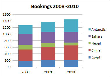
Exercise 9.2 Travel bookings (graf002)
File: Graf002.xlsx
The following table lists the travel booking data for the years 2008-2010.
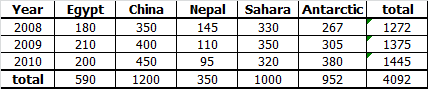
Enter the data in a worksheet and use formulas for the totals. Then, create the following chart.
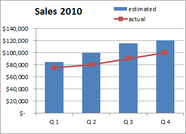
Exercise 9.3 Sales figures (graf003)
File: Graf003.xlsx
The following table shows the estimated and actual sales figures per quarter for 2010, as well as the difference between them. The average percentage of the differences is also calculated.
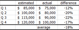
Enter the data in a worksheet and use formulas for the differences and the average. Then, create the following chart.
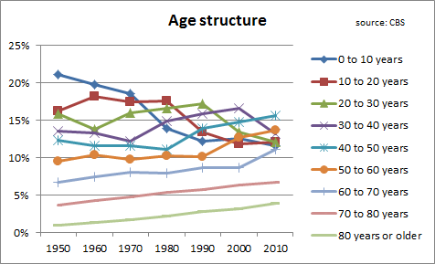
Exercise 9.4 Age structure (graf004)
File: Graf004.xlsx
The following table lists the percentages of the Dutch population’s age structure for the years 1950-2010, divided into nine age classes (source: CBS).
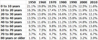
Create the following chart from this data.
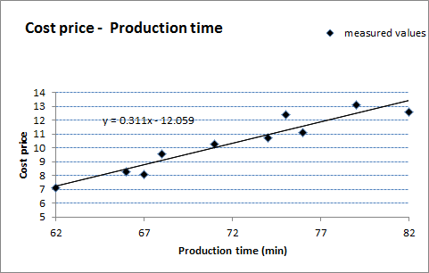
Exercise 9.5 Relationship between production time and cost (graf005)
File:Graf005.xlsx
A toy manufacturing company suspects that the price of toys largely depends on production time. To investigate this, they measured the production time of the toys. The results and associated costs are shown in the following figure.
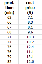
Create a chart that plots cost against production time (the independent variable).
Add a linear trend line to the chart, and include the trend line’s equation.
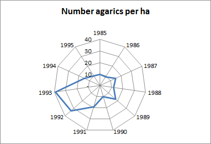
Exercise 9.6 Counting agarics (graf006)
File: Graf006.xlsx
The number of agarics in a given area is counted annually. The following table shows the number of agarics per hectare for several years.
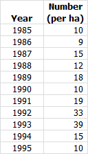
Create the following chart from this data.