13 PivotTables
A PivotTable is a data summarization tool. It’s an interactive dynamic table in which you can quickly and easily summarize, combine, and compare large amounts of data. It is necessary that the data is properly organized in a worksheet.
A pivot table is especially suitable when variables need to be plotted against other variables, allowing you to get answers to questions such as:
- Which product makes the highest profit contribution?
- Which salesman makes the highest turnover?
- Which department incurs the most costs?
- …
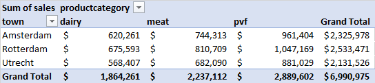
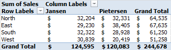
Example 13.1 Sales by category
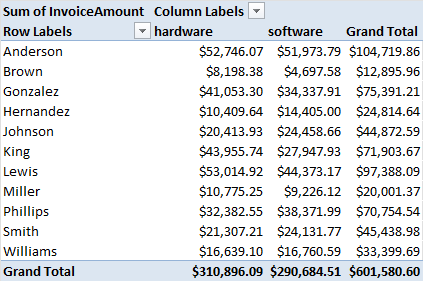
In the pivot table in Figure 13.1 you can easily compare the turnover in the three product categories.
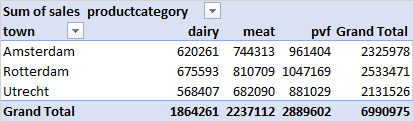
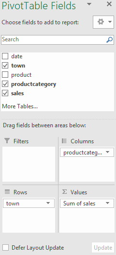
A pivot table plots at least two types of data against each other. One data type goes in the column field, here productcategory, the other in the row field, here town. In addition, a data type whose results you want to see must be placed in the value field, here Sales.
Because these results are summarized, it is also necessary to indicate which calculation should be used, here Sum, the default choice.
A PivotTable has four areas in which you can place fields:
| Area | Description |
|---|---|
| Values | The fields with numeric information you want to summarize, usually for the calculation of totals and averages. |
| Rows | These fields are used to create separate groups and put the information for each group in a separate row. |
| Columns | These fields are also used to create separate groups. Mostly used if you want to subdivide the data into the rows. These groups are displayed in separate columns. Take fields with not too many groups, otherwise, the table will come too wide. |
| Filters | These fields can be used for filtering the data. |
13.1 Creating PivotTables
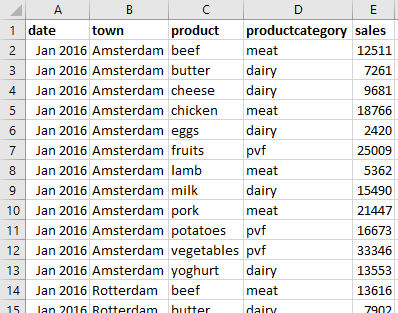
The file for this task contains the monthly sales in 2016 of three supermarkets for different products, see Figure 13.2. These products are divided into three product groups: pvf (potatoes, vegetables, fruit), meat and dairy. This data is analyzed using a pivot table.
Information need: What are the total sales per town per productcategory?.
Task 13.1 File: Supermarket.xlsx
Open the file.
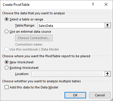
Select any cell in the table. Choose tab Insert > PivotTable (group Tables) > From Table/Range.
The dialog box Create PivotTable appears. The range of the table has already filled in.
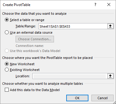
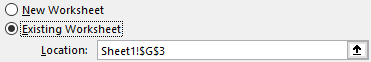
- In this task, the PivotTable should appear in the existing worksheet. Select Existing Worksheet and click on an empty cell in the worksheet, e.g. cell G3.
- Click OK.
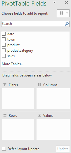
An empty PivotTable is created on the worksheet and a task pane appears on the right side with the PivotTable fields in which you can add fields to the report.
The task panel with the field list will be shown when a cell in the PivotTable is the active cell. As soon as you click on a cell outside the PivotTable, the task panel disappears. The panel appears again when you click on any cell within the PivotTable.
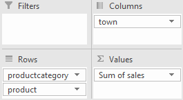
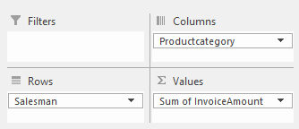
- Drag in the task panel field town to the area Rows, field productcategory to the area Columns, and field sales to the area Values. At the last action, the calculation method
Sumof the Sales is applied automatically.
You can delete a field from the PivotTable by dragging it out of the area.
The PivotTable in the worksheet is filled with the data.
Task 13.2 Formatting values as accounting numbers
- Select any numeric value in the PivotTable. Choose tab PivotTable Analyze > Field Settings (group Active Field.
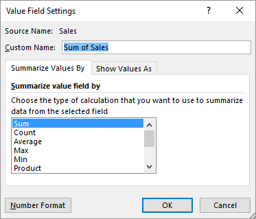
The dialog box Value Field Settings is very important when creating pivot table reports. You can arrange various things here, such as:
- the name to be displayed via the box Custom Name.
- the calculation method, default
Sum. Other options are:Count,Average,Min,Max,Product,Stdev,Stdevp,Var,Varp. - how you want to display the values, for example as percentages of the row or column total.
Click on the button Number Format. The dialog box Format Cells is displayed.
Choose category Accounting > Decimal places: 0 > Symbol: $.
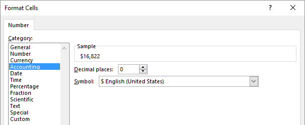
- Click OK > OK.
The value fields in the PivotTable appear in the specified format.
Task 13.3 Changing column labels and row labels by a field name
Select any cell in the PivotTable. Choose tab Design > Report Layout (group Layout) > Show in Outline Form.
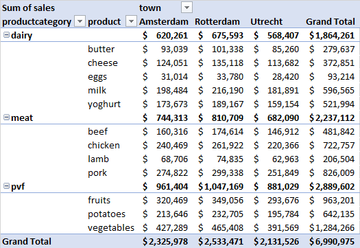
Task 13.4 Analyzing products within each productcategory
- Drag field productcategory frow Columns to Rows and field town from Rows to Columns. Next drag field product to Rows and below field productcategory.
Instead of total sales you can also calculate other values, for example, the average monthly sales.
- Select any numeric value in the PivotTable and change through the Field Settings, see Figure 13.8, the calculation type in
Average.
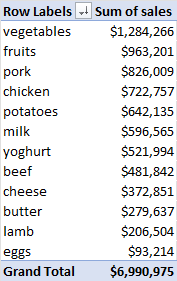
Task 13.5 Top 3 products
Now try to answer the following question using pivot tables:
Which three products generate the most sales?
Use product as row variabele. There is no column variable in this case. In the pivot table report, sort revenue from highest to lowest.
13.2 Finding Data Sources
A PivotTable contains summarized data. In this task, you learn how to find the source of these data.
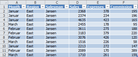
In a worksheet are some data of employees like sales, expenses, and provision per month and per region. A PivotTable with the sales per region per employee has been created in another worksheet.
If you want the individual values a result is provided, Excel can show you this quickly and easily. By double-clicking on a result, Excel creates a new worksheet containing a table with the source data.
Task 13.6 File: Sales.xlsx
Open the file.
Select the worksheet PivotTable and double-click on the results of Jansen in the region East.
A new worksheet with a list of all information about Jansen in the region East is created.
13.3 Grouping data
You can make a cluttered list of data more suitable for analysis by grouping the data. This is especially the case when the data contains dates. Dates can often be grouped into years, quarters or months. In a pivot table you can view the data per year, per quarter or per month.
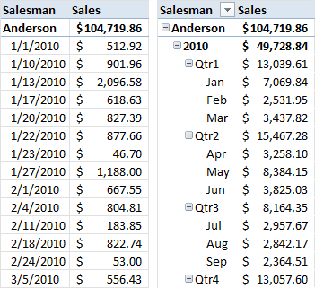
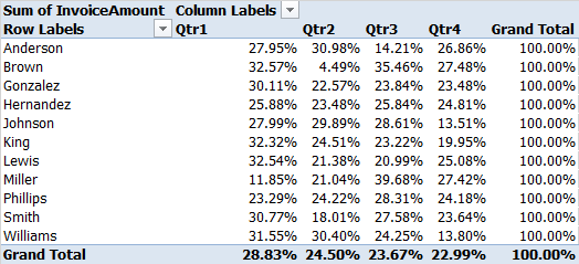
Example 13.2 Revenue per salesperson
Figure 13.15 shows part of a pivot table showing revenue per salesperson. In the left image the revenue is in date order (ungrouped). In the right image the revenue is grouped by quarter and by month.
As of version 2016 Excel has the function time grouping. Automatically discovers and groups time-related fields. When adding such a field to a pivot table, new relevant fields are automatically created, such as Years, Quarters and Months.
Which date/time fields are added depends on the level of detail of the date/time field in the data table. For example, if the date data is in days and spans more than a year, additional fields are created for months, quarters, and years.
Once the fields have been added you can start analyzing the data over the different time periods with zoom-in options. This way you can sometimes find extra insights.
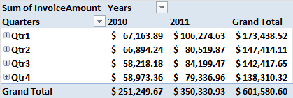
Example 13.3 quarterly comparison by year
For example, to get a quarterly comparison over several years you can place the field Years in the box Columns and the field Quarters in the box Rows.
The + button in the pivot table indicates a collapsed level. When you click on this, all elements in the pivot table are expanded to the next level, here Months. The + button then changes into a - button that allows you to collapse the group again. This is also known as zoom in or drill-down.
- Custom grouping
- You can adjust the grouping by right-clicking on a date/time field in the pivot table and then choosing Group. In the Grouping dialog box that appears, you can add or remove other time levels.
- Ungroup
- You can cancel a group by right-clicking on a grouped field in the pivot table and then choosing Ungroup.
13.4 Grouping Example
An example of grouping data based on a date field.
Task 13.7 File: Invoices.xlsx
- Open the file.
The file contains a data table named SalesData and columns Region, Salesman, InvoiceNr, InvoiceDate, ProductCategory, and InvoiceAmount.
First, a PivotTable with the sales per salesman per product category is created.
- Select any cell in the table. Choose tab Insert > PivotTable (group Tables).
Since the data area here is a table called Sales Dates, this name is automatically filled in and not the cell addresses.
To have the pivot table appear on a new worksheet, accept the default option New Worksheet.
Click OK.
Create a pivot table according to the design in Figure 13.18 and give the amounts a currency format. The result can be seen in Figure 13.19.
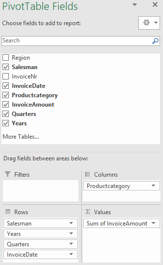
- Drag field InvoiceDate to the area Rows and below field Salesman. Excel’s automatic time grouping feature creates two calculated fields, Years and Quarters in the Rows area.
In the PivotTable, Figure 13.21, the sales are now grouped per year. This also shows that Brown started as a seller in 2011 and not in 2010, which could be a possible explanation for the lower amounts.
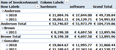
Click on the + (plus) button on any seller for the year 2010. This will expand the year to quarters for all sellers.
Click the + (plus) button for Qrt1 at any seller. As a result, the quarter is unfolded to the months for all sellers.
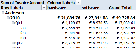
Experiment with unfolding and folding levels again.
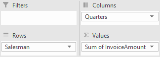
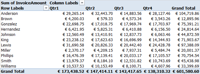
Drag field Product Category out of the Columns box, field Quarters from Rows to Columns and the fields Years and Invoice Date out of the Rows. The design will now look like Figure 13.23. The result can be seen in Figure 13.24.
To easily compare values you can also choose for displaying percentages (of row total, column total ,or grand total).
- Select a numeric value in the PivotTable and choose tab PivotTable Analyze > Field Settings (group Active Field). In the dialog box select tab Show values As and select % of Row Total.
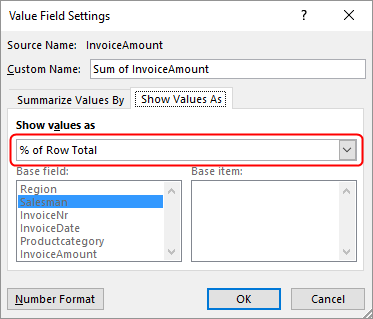
- Click OK.
12, Then display the values as % of Column Total.
Questions
Use the PivotTable possibilities to answer the following questions. There are multiple ways to find the answers.
- Which seller sold the most in December 2010?
Seller
- In which month of which year were software sales the highest?
Year Month
- View hardware and software sales percentages by region. What is the percentage for software in the South region?
Rounded to whole number:
- What quarter of what year were Anderson’s sales lowest?
Year Quarter
- Check out Brown’s sales in Q2 2011. Do you notice something special?
Only turnover in the month of June. Nothing in April and May.
13.5 Filtering
To filter the data in a pivot table, you can place a field (or more fields) in the Filters box in the task window. But when you filter on multiple items, you can’t easily see what you’re filtering on.
A more user-friendly way is using slicers. These contain a number of buttons that allow you to quickly filter the data in a pivot table. And just for filtering time data you can also use timelines, which are identical to slicers.
You see the use of slicers and timelines a lot in so-called dashboards because you can link them to multiple pivot tables and pivot charts.
Three subtasks discuss creating report filters, slicers, and timelines. The file [Supermarket.xlsx` is used for this, the same file as in Section 13.1, which contains the monthly sales data in 2016 of a number of products, which are classified in three product groups: pvf (potatoes, vegetables, and fruits), meat and dairy.
13.5.1 Report filters
Task 13.8 File: Supermarket.xlsx
Open the file.
Insert a pivot table for the data on a new worksheet.
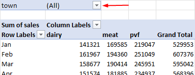
Place the productcategory field in Columns, the sales field in Values and the date field in Rows.
Excel’s automatic time grouping adds the calculated field Months to the Rows. No other fields like quarters and years are added because all dates are only the last day of the month in one year.
Drag the date field from Rows so that it only shows the Months field.
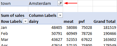
Place the town field in the Filters box. This will create a report filter in the pivot table.
- Click the drop-down arrow and select
Amsterdam.
- Click the drop-down arrow, check the box Select Multiple items and then select
AmsterdamandRotterdam.
The data for both towns is displayed. Unfortunately, the filter only indicates that multiple items are selected, but not which items. For this scenario, slicers are a better alternative.
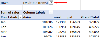
Click the drop-down arrow and re-select the (All) option.
Remove the town field from the Filters box.
13.5.2 Slicers
Task 13.9 Continue with the file from Task 13.8.
- Right-click on field town in the PivotTable field list and select Add as Slicer.
And a slicer is created in the worksheet.
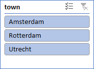
- Experiment with the slicer by selecting an item. You can select multiple items with the use of the Ctrl key or the
 button.
Another way to create slicers is through the menu. This way you can add multiple slicers at once.
- Click anywhere in the PivotTable report and choose tab PivotTable Analyze > Insert Slicer (group Filter).
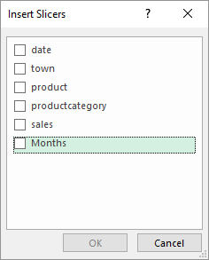
- Select Months and click OK.
With tab Slicer on the ribbon, you can format a slicer such as change their look, settings, colors, …
Experiment with filtering the data with the two slicers.
Delete all slicers by first selecting a slicer and then pressing the Delete key.
13.5.3 Time lines
Timelines are like slicers. They also allow you to filter data but they are specific for use with date/time fields. The dates appear in a horizontal line from oldest to newest as you move from left to right on the timeline.
Task 13.10 Continue with the file from Task 13.9.
- Click anywhere in the PivotTable report and choose tab PivotTable Analyze > Insert Timeline (group Filter).
The Insert Timeline dialog box only shows the date field because it is the only date/time field.
- Select date and click OK.
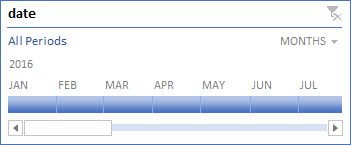
- A scroll bar for the visible period.
- Handles to select the period to filter on.
- Choice of the time period to be displayed (Years, Quarters, Months, Days).
- When you select a timeline you get handles on the edges with which you can make the area bigger/smaller.
Select some months to see the results.
Click on the period selector in the upper right corner and select Quarters.
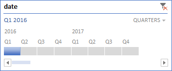
Select some quarters to see the results.
Delete the timeline by selecting it and then pressing the Delete key.
13.6 Pivot Charts
A PivotChart shows data series, categories, and chart axes the same way a standard chart does. But it also gives you interactive filtering so you can quickly analyze a subset of your data. And you can use slicers for filtering data.
Task 13.11 File: Sales.xlsx
Open the file.
Select worksheet PivotTable and then select any cell in the PivotTable on this worksheet.
Choose tab Insert > PivotChart (group Charts) > Clustered Column > OK.
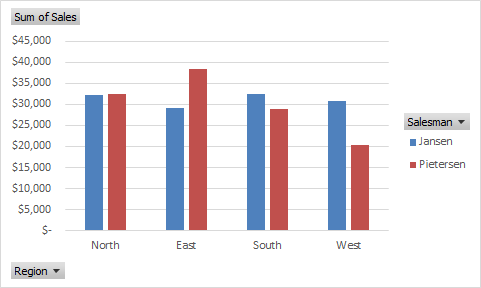
The PivotChart has filters for Region and Salesman. When you use a filter in the chart, then also the data in the PivotTable will be filtered.
Experiment with filtering on a salesman and observe the results. End with displaying the data for all salesman.
Add a slicer for Month and experiment with it.
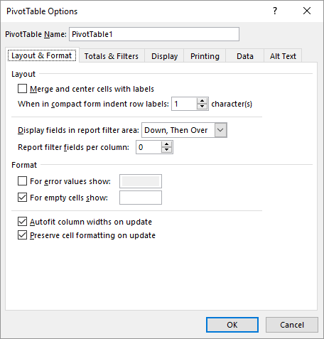
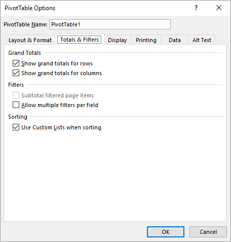
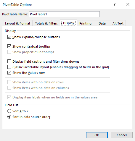
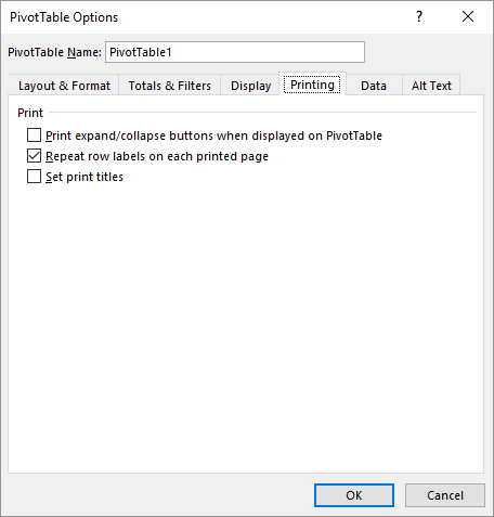
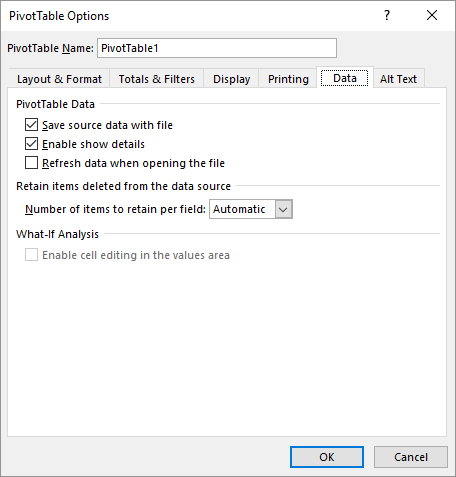
13.7 PivotTables Options
There are various setting options for pivot tables. To do this, choose any cell in a PivotTable and then PivotTable Analyze tab > Options (PivotTable group). You have several setting options via tabs (see below).
13.8 Exercises
Exercise 13.1 Salary averages (pivo001)
Create a pivot table to calculate the average salary per department and division. The table should look as follows.
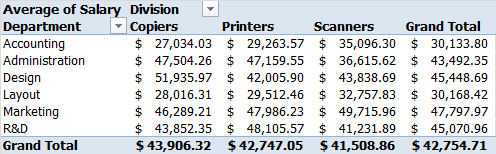
File: Personnel.xlsx
Exercise 13.2 Salary totals (pivo002)
Create a pivot table to calculate the total salary per function and per division. Furthermore, it should be possible to filter per department. The table should look as follows.
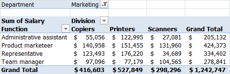
File: Personnel.xlsx
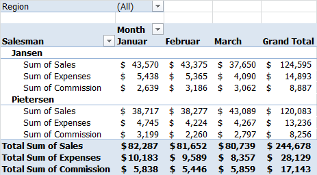
Exercise 13.3 Turnover, travel expenses and commission (pivo003)
For each salesman the following information is stored in the worksheet: Month, Region, Saleman, Sales, Expenses, and Commission.
Create one pivot table with which you get an overview of the total sales, expenses, and commission per month and per salesman with a possibility to filter per region. All values should have a currency format with no decimals.
File: Pivo003.xlsx
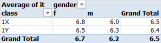
Exercise 13.4 Average rating (pivo004)
In the following table, you see the marks for information technology (it) of some students from two different classes.
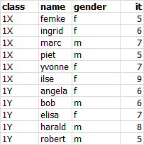
Determine using a pivot table the average mark by class and by gender.
File: Pivo004.xlsx
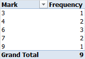
Exercise 13.5 Frequency distribution figures (pivo005)
In the following table, you see the marks of some students.
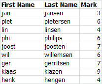
Create a frequency distribution of the grades using a pivot table.
File: Pivo005.xlsx
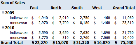
Exercise 13.6 Clothing sales by region (pivo006)
In the following table, you see the menswear and ladieswear sales in the four regions in the years 2009 and 2010.
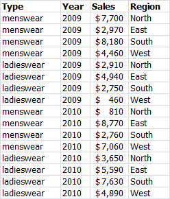
Enter and format the data in a worksheet. Determine using a pivot table the total annual sales per region and per type.
File: Pivo006.xlsx
Exercise 13.7 Shop opening hours (pivo007)
By order of the shopkeepers’ association, a survey was conducted on the evening opening hours of shops. The results of the interviewees can be seen in the following table
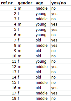
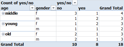
Enter the data in a worksheet. Determine using a pivot table the number of supporters and opponents by age and by sex.
File: Pivo007.xlsx
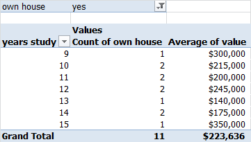
Exercise 13.8 Own home and average home value (pivo008)
In the following table, you see for some people how many years of study they have, whether or not they have their own house and if applicable the value of the house.
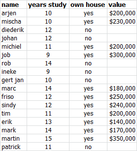
Enter the data in a worksheet. Determine using a pivot table the number of people with their own house and the average value of the house as a function of the number of years of study.
File: Pivo008.xlsx
Exercise 13.9 Transport research (pivo009)
Market research has been performed among the visitors of the city center. The following table shows the data of the respondents who were questioned about the means of transport to the center to go shopping. In the table you see if they went by car or by bus, how far they live from the center (in km.) and the travel time (in min.)
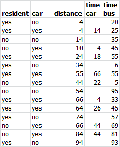
Enter the data in a worksheet. Determine using a pivot table the average travel time by car for residents living more than 15 km from the city center.
File: Pivo009.xlsx
Create an extra column to determine if the distance to the center is more than 15 km.
28.5 min.
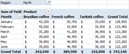
Exercise 13.10 Coffee yield per region (pivo010)
A worksheet contains the yields of some types of coffee per month and per area. The management would like to determine the total yield of the products for each region. Create a pivot table for the monthly yields per coffee type. The region should be selected through a report filter.
File: Coffee.xlsx
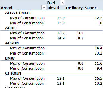
Exercise 13.11 Fuel consumption cars (pivo011)
Determine using a pivot table the minimum and maximum fuel consumption per car brand and fuel type.
File: Car.xlsx
Hobby club (pivo012)
In a worksheet, you can find in the last two columns the number of visited club meetings in 2009 and 2010. Create using pivot tables in the next reports:
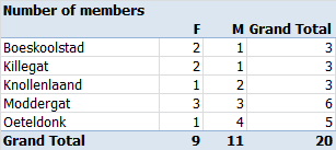
- The number of members of the club by domicile and by gender.
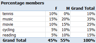
- The percentage of members by hobby and by gender.
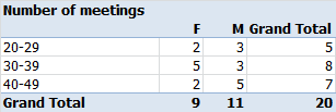
- An overview of the presence in 2010 by gender, with the number of visited club meetings divided into three groups as shown in the following figure:
Exercise 13.12 File: Pivo012.xls
- The number of members by domicile and by gender
- The percentage of members by hobby and by gender
- Presence in 2010 by gender